
Did you hygge (pronounced hoo-gah) in 2017? Are you planning to lagom (pronounced lah-ghom) in the New Year? Not since IKEA became a mainstay in American home interiors, after the first one opened in the U.S. in 1985, have Scandinavian terms garnered so much attention in our design vocabulary. So what exactly is everyone talking about? SEED explains below.
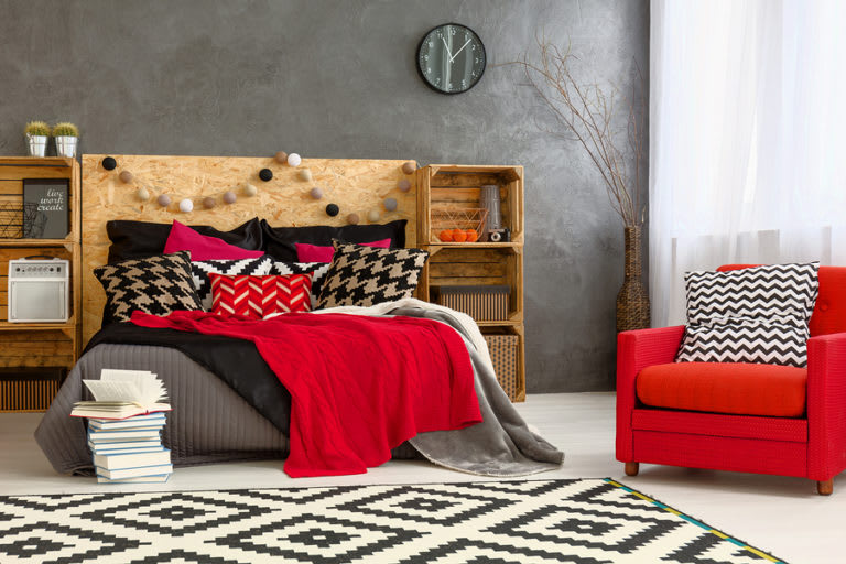
If you checked anyone’s Instagram interior design feed in 2017, chances are you came across the concept of hygge even if you didn’t know it was there. Hygge is the Danish concept of coziness and became personified by images of cozy throws, sheepskin beanbags, warm fires and all those cutesy quote boards. Hygge basically remind us to enjoy life’s simple pleasures.
In 2018, however, experts predict the design tide will turn toward the Swedish word lagom, which is all about living a frugal life in balance. Reminiscent of Marie Kando’s Life Changing Magic of Tidying Up, a rough translation of the word lagom is “not too little; not too much—just right.” The idea is that the way to be content in life is to take a “lagom” amount of it. This translates into home design through sustainable living, upcycling and recycling and de-cluttering your home.
All this talk of living a balanced life may have you dreaming of decorating in muted, neutral tones; however, the major paint companies have taken the opposite approach when determining the “it” colors for next year.
Here are the 2018 colors of the year:
Benjamin Moore: Caliente
Described by the company as “strong, radiant and full of energy,” Caliente is a warm, inviting hue that’s easy to love (well, if you like red).
Sherwin Williams: Oceanside
Sherwin Williams calls it “a complex, deep color that offers a sense of the familiar with a hint of the unknown”; it’s a bold, rich bluish-green jewel tone that works beautifully with another one of 2018’s design trends—copper metallic tones.
Pittsburg Paints: Black Flame
A color that “evokes privacy, hope and classic modernism,” Black Flame is blend of black and indigo that works as a bold, neutral backdrop to let your other elements of décor shine.
Behr: In the Moment
Perhaps the only color on 2018’s list that plays with the idea of a balanced life, this cool spruce blue “speaks to our desire to take a break, be present and recharge,” according to the company.
Pantone: Ultra Violet
Bright and complex, this color is everything we want 2018 to be. Pantone explains, “Enigmatic purples have also long been symbolic of counterculture, unconventionality, and artistic brilliance.”
2018 Design Outlook:
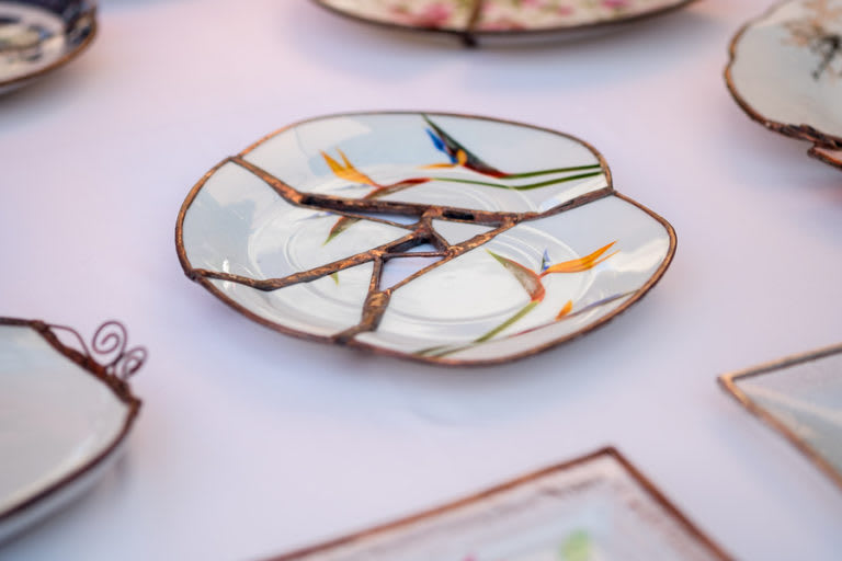
And, finally, there is the idea of wabi-sabi—the Japanese philosophy of embracing authenticity even if it’s a little off (i.e. a messy bed is okay). Contrasting the clean, minimalist style of 2017 (picture the “all-white kitchen”), wabi-sabi recognizes that homes are meant to be lived in; not perfect. The use of organic materials and innately imperfect objects, like a cutting board with scratches or a marble coaster with a ding, is key to this lifestyle that aims to “keep it real.”
So it turns out the predictions for 2018 are somewhat unpredictable. Bright colors contrasted with balanced, yet messy, living. If you’re excited about the New Year and want to keep up with the latest design trends with a local spin, follow SEED Property Group on Instagram!