
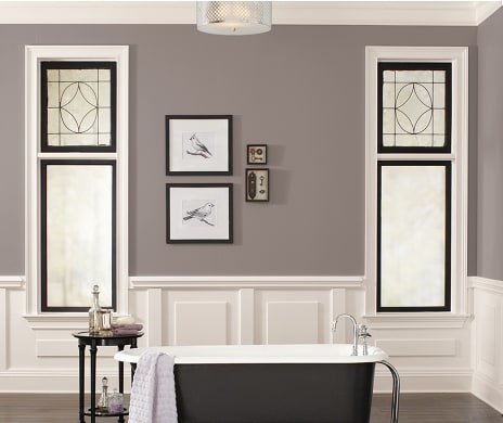
Pantone calls it Greenery and describes the color as a “refreshing and vitalizing shade…symbolic of new beginnings.” The experts at Benjamin Moore claim it’s Shadow: “allusive and enigmatic—a master of ambiance.” At Sherwin Williams they say Poised Taupe, which “diffuses stresses of the world outside our doors.”
And Farrow & Ball has named it Peignoir “after the sheer floaty garment traditionally worn by ladies brushing their hair in the mid-19th century.” What do these all have in common? They have all been named the color of the year for 2017. Whether you’re seeking a bright and lively yellow-green reminiscent of nature (Greenery) or a romantic and whimsical blush that works seamlessly in both traditional and modern homes (Peignoir), consult our roundup of 2017 color trends before you break out the brush.
Credit: Sherman Williams (2017 Color of the Year, Poised Taupe)
In Living Color
While pondering interior accent colors for 2017, think of deep, rich blues and greens. Picture navy and jade with underlying grey tones that illustrate the perfect juxtaposition of moody and tranquil. Endless Sea by Sherwin Williams and Courtyard Green from Benjamin Moore are two colors that embody this richness of color.
Greyer Shade of Pale
If you aren’t ready to take the color plunge, below is a list of tried-and-true neutrals that will wake up tired walls. As living spaces become more open and flexible, homeowners want colors that flow from one room to the next. Gone are the days of painting one room yellow and one room green and one room red. Today’s savvy buyers know the importance of both spaces and colors performing multitasks. For example, a grey-blue can be both moody and inviting while a soft blush is whimsical yet grown-up. One thing the colors below have in common is an underlying grey tone—a definite “do” in 2017.
Benjamin Moore White Dove: the white that interior designers have been using for years to paint everything. It is a soft, warm white with the tiniest touch of grey; often used as the “universal” trim and cabinet color choice because of its ability to meld with all colors.
Benjamin Moore Horizon: a light, soft grey that is the perfect backdrop for all things interior. It works beautifully with blues and greens and is an excellent choice for a room that doesn’t get a lot of natural light, yet you want it to feel “white.” [Design note: white walls work best in rooms that receive an abundance of sunlight; otherwise white can feel sterile].
Farrow & Ball Cornforth White: a pale grey that also reads taupe or lavender and changes from cool in morning light to warm and moody at night.
Sherwin Williams Silver Strand: a cool, grey-blue that provides depth and subtle color to rooms with no natural light (think: small, windowless powder room).
In addition to leaning toward the grey scale, the shades here also pair beautifully with copper accents—another interior design trend to keep your eye on for 2017.